People
Summary of the 10 Usability Heuristics
Jakob Nielsen developed the 10 usability heuristics with Rolf Molich in 1990 which was released in 1994 and is still used today. These heuristics are broad rules of thumb for identifying problems in a system’s user interface (UI).
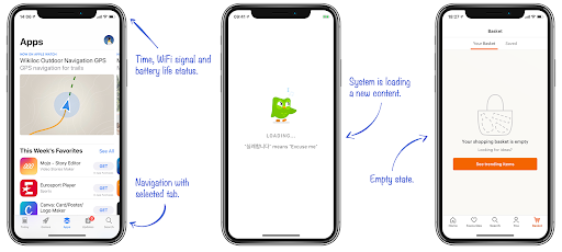
1. Visibility of system status
The first usability heuristic talks about how the system should provide immediate feedback to inform the user of the current state because they need to know whether the interaction was successful. This allows users to feel in control of the system and more information results in better decision making and trust in the brand.


2. Match between system and the real world
Users find comfort in familiarity and therefore the system should speak the user’s language with words and phrases similar to the user. It does not only apply to words, UI elements should also reflect objects from the real world as this makes it easier for users to learn and remember how the interface works. For example, sending a text message feels like passing a note and choosing a film on Netflix feels like scanning the shelves of a video store. Other great examples of real-world matching icons are:


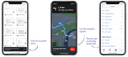
3. User control and freedom
As mentioned in the first usability heuristic, users like a sense of control and freedom so it is important that the system allows for users to easily exit the current interaction i.e. with a Cancel button. In addition, users often make mistakes so it’s helpful to have an undo and redo button so the user doesn’t feel stuck and frustrated.

4. Consistency and standards
The user already has an expectation before using the system therefore the system should be consistent and not increase the user’s cognitive load. A standard ensures that users can understand the words, situations or actions and that they know where to look for certain features. An example of this is the copy-paste functionality, it works the same on all applications.
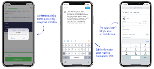
5. Error prevention
Good error messages are important, however, it is better to design a system that prevents the errors happening in the first place. There are two types of user errors; slips and mistakes. Slips occur when users intend to perform one action but end up doing another, generally when the user is on autopilot, e.g typing “i” instead of “o”. Mistakes are conscious errors that occur when the user takes the right steps to complete the goal but have incomplete or incorrect information to match how the interface works which results in an error.

6. Recognition rather than recall
The system should limit the user’s memory load by reducing the information the user needs to remember, the interface should promote recognition rather than recall. The difference between recognition and recall is the amount of cues required to retrieve information from memory. I.e. answering “Did Herman Melville write Moby Dick?” involves recognition, you simply have to recognise whether the information is correct. Whereas, the question “Who wrote Moby Dick?” requires recall in order to retrieve the right answer from memory.
7. Flexibility and efficiency of use
The system should allow for flexibility and ability to tailor actions in order to cater for both inexperienced and experienced users. Again, the copy-paste functionality is a good example of this, inexperienced users can find the copy and paste button while experienced users will know that the keyboard shortcut Ctrl+C and Ctrl+V are used to copy and paste. The three main tips to improve the flexibility and efficiency are; to provide accelerators such as keyboard shortcuts and touch gestures, provide the ability to personalise and tailor content or functionality, and allow for customisation to meet the user’s specific needs.
8. Aesthetic and minimalist design
The content and design of the system should be focused on the essentials and not contain information that is irrelevant or not needed as this distracts the user from their primary goal and diminishes their relativity. A good way to create this is whitespace, it increases content legibility and highlights call to action buttons.
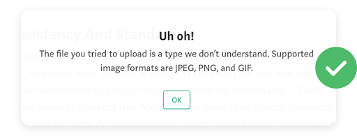
9. Help users recognise, diagnose and recover from errors
Error messages should be displayed in a language that the user will understand avoiding any technical wording. It should also indicate the problem and offer a solution.
Good error message should be:
- Explicit: user feedback to indicate that something has gone wrong
- Human-readable: language instead of codes or abbreviations
- Polite: phrasing that doesn’t blame users or imply they are stupid or doing something wrong
- Precise: descriptions of exact problems rather than vague generalities such as “syntax error”
- Constructive advice: on how to fix the problem. E.g. out of stock - should tell the user when the product is available or provide a way for users to ask to be notified when the product is back in stock

10. Help and documentation
Ideally, the system should be self explanatory however sometimes it may be necessary to provide help and documentation. The content should be easy to search, focused on the user’s task and should be clear and concise. E.g. Duolingo and Slack do a good job of onboarding or another form of help could be Frequently Asked Questions (FAQs).
Want more?
This is my summary of Jakob Nielsen’s 10 usability heuristics. You can also get the poster as well as the full articles of each heuristic here: https://www.nngroup.com/articles/ten-usability-heuristics/.
Images in this blog can be found here: https://uxdesign.cc/10-usability-heuristics-every-designer-should-know-129b9779ac53


